By @culturaltutor at Twitter
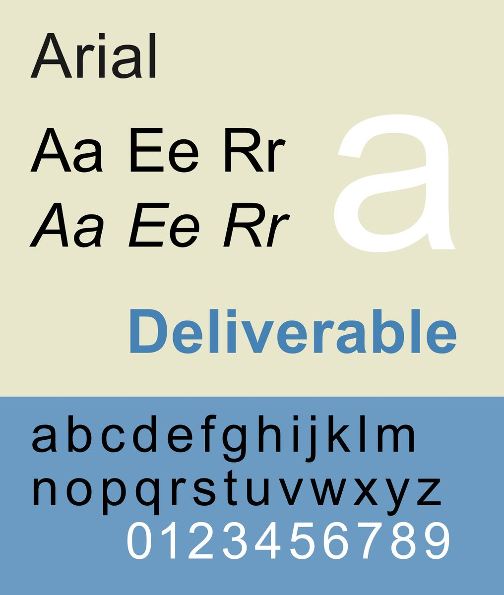
Arial
A classic font, designed in 1982 by Robin Nicholas and Patricia Saunders, and once the default for things like PowerPoint and Excel.
But Arial has a secret: it’s a knock-off with exactly the same letter width as another font in this list…
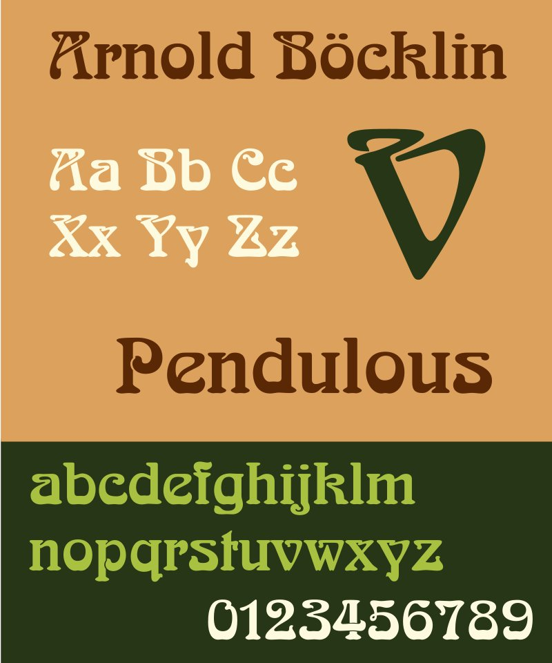
Arnold Böcklin
Designed by Otto Weisert in 1904 and named after the painter (most famous for the Isle of the Dead), this might be the most evocative typeface ever created.
It oozes Art Nouveau, though it *isn’t* the same font used by Hector Guimard in his Paris Metro signs.
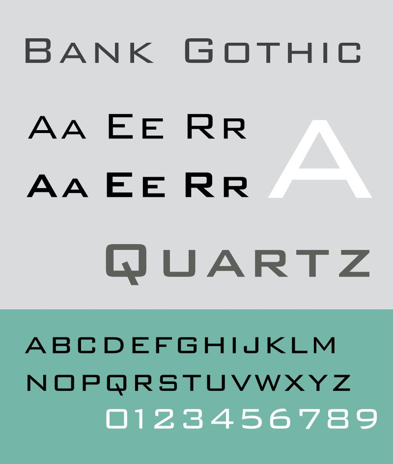
Bank Gothic
Created in the early 1930s by Morris Fuller Benton, perhaps America’s greatest typeface designer, Bank Gothic is more common than you think.
It’s been used in everything from the facade of Arsenal’s Emirates Stadium to the Grand Theft Auto video games.
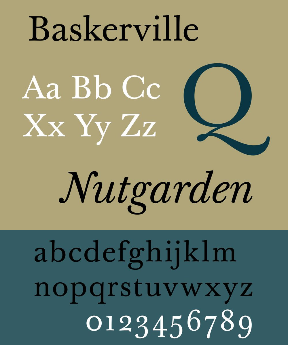
Baskerville
Created in the 1750s by John Baskerville, a British stonemason, calligrapher, and industrialist.
His dream was to drastically improve the quality of book printing in Britain, and introduced a cleaner, crisper typeface as part of the process.
A lasting success.
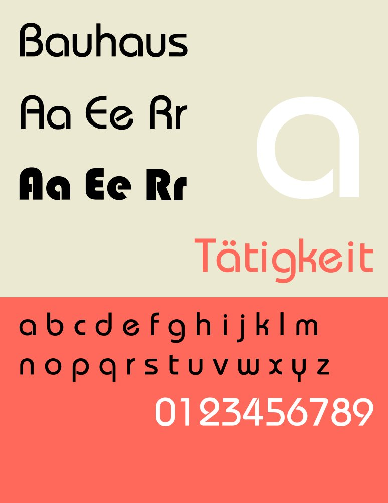
Bauhaus
Not directly created by the radical, innovative, and incredibly influential Bauhaus design school which flourished in Germany in the 1920s.
But it was based on an experimental «universal font» created for them by Herbert Bayer; the digital interpretation is from 1993.
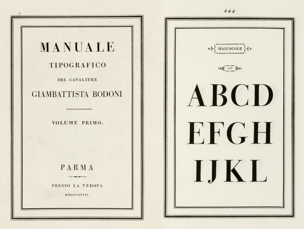
Bodoni
Created by the prolific Italian typographer Giambattista Bodoni in the late 18th century.
Not well-suited to digital reproduction because of its thin strokes, but an elegant choice for anything printed, and a popular font ever since its creation.
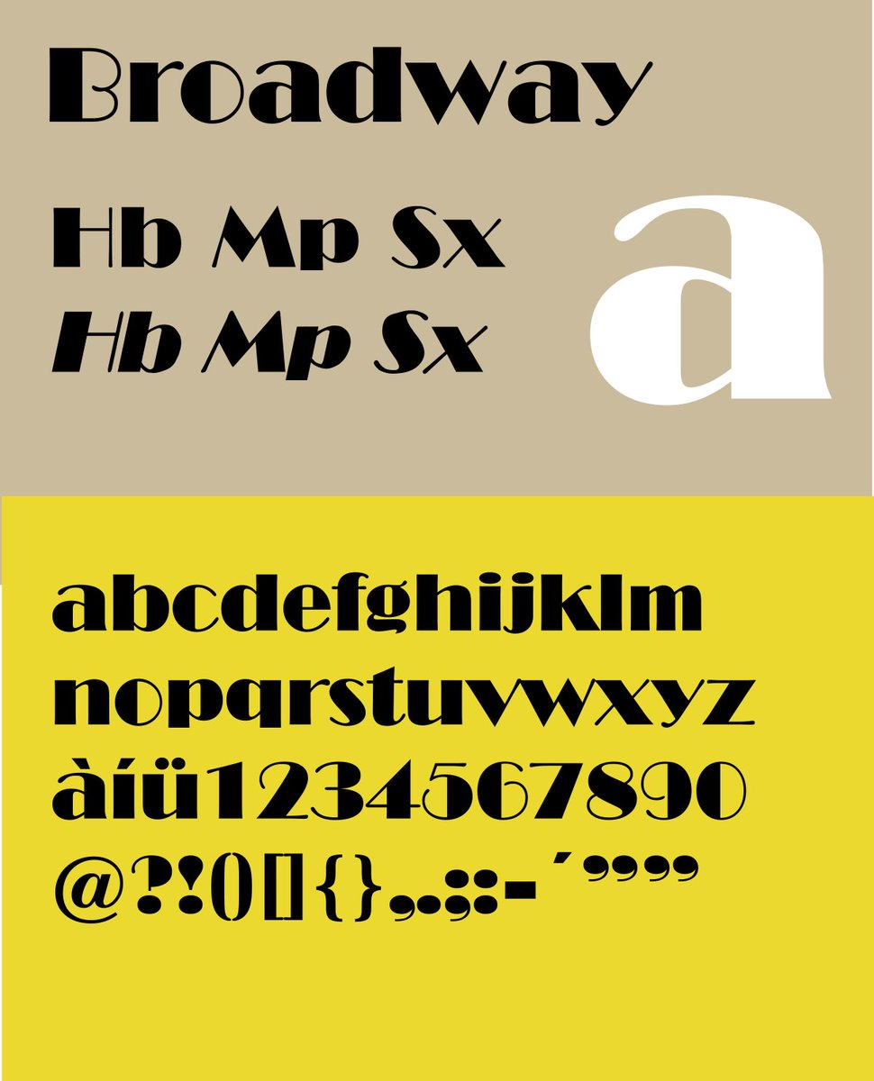
Broadway
Similar to Arnold Böcklin in that it immediately calls to mind a specific era — in this case, Art Deco — though it is perhaps a little overdone.
Designed in 1927 by none other than Morris Fuller Benton, Broadway is almost always used to evoke the 1920s or 1930s.
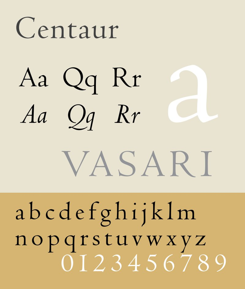
Centaur
One of the most underrated fonts. Perfect for body text or heading, it was designed in 1914 by Bruce Rogers, based on a font used by the Venetian-based French printer Nicolas Jenson in the 1470s. The Italic version is called Arrighi.
Always a classy choice.
Chiller
The first of several iconic and ubiquitous 1990s fonts created during the age of digitalisation, Chiller was designed by Andrew Smith.
The go-to «scary» font, used on signs advertising ghost tours worldwide.
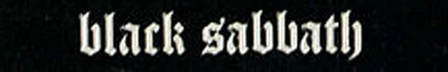
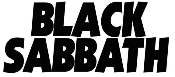
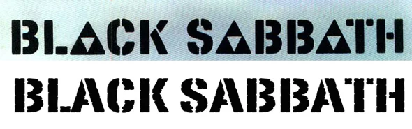
Cloister Black
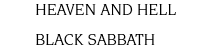
Used for the band name on Black Sabbath’s fifth album.
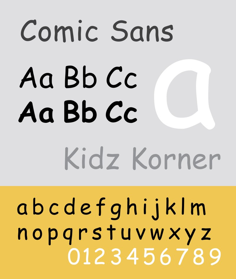
Comic Sans
Perhaps the most controversial typeface of all time (and that’s saying something) Comic Sans was designed in 1994 by Vincent Connare, based on the fonts used in comic book speech bubbles.
It’s been around since Windows 95, and it’s never going away.
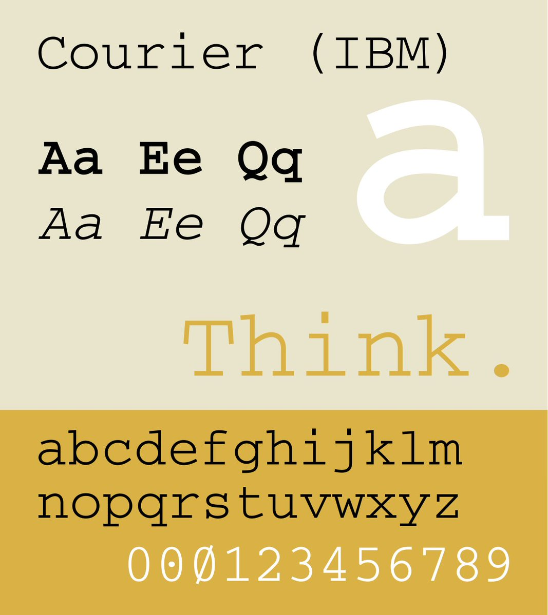
Courier New
Added to Windows 3.1 in 1992 (and present ever since) as a digitised version of Courier, which was itself designed by Howard Kettler for IBM in 1956.
Courier is the classic «typewriter» font, famous for being used in all screenplays and in coding.
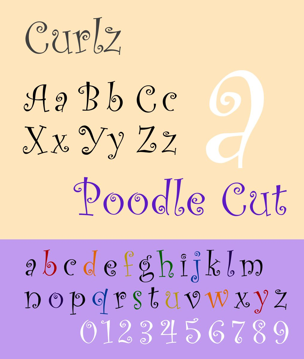
Curlz
Another classic 1990s early Digital Age typeface, designed by Carl Crossgrove and Steve Matteson in 1995 as fun, decorative font for posters and t-shirts.
Like its cousins (Chiller, Comic Sans, Papyrus) Curlz has perhaps been used far too much, and often inappropriately.
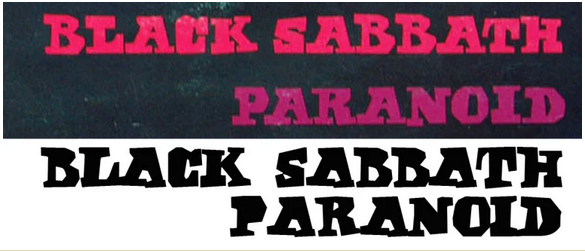
Dark Black
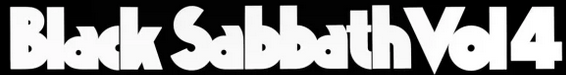
The closest thing to the font on Paranoid, and available for download from allfont.net. The original is another Marcus Keef design, featuring lettering that is obviously hand drawn. SabbathParanoid is another alternative.
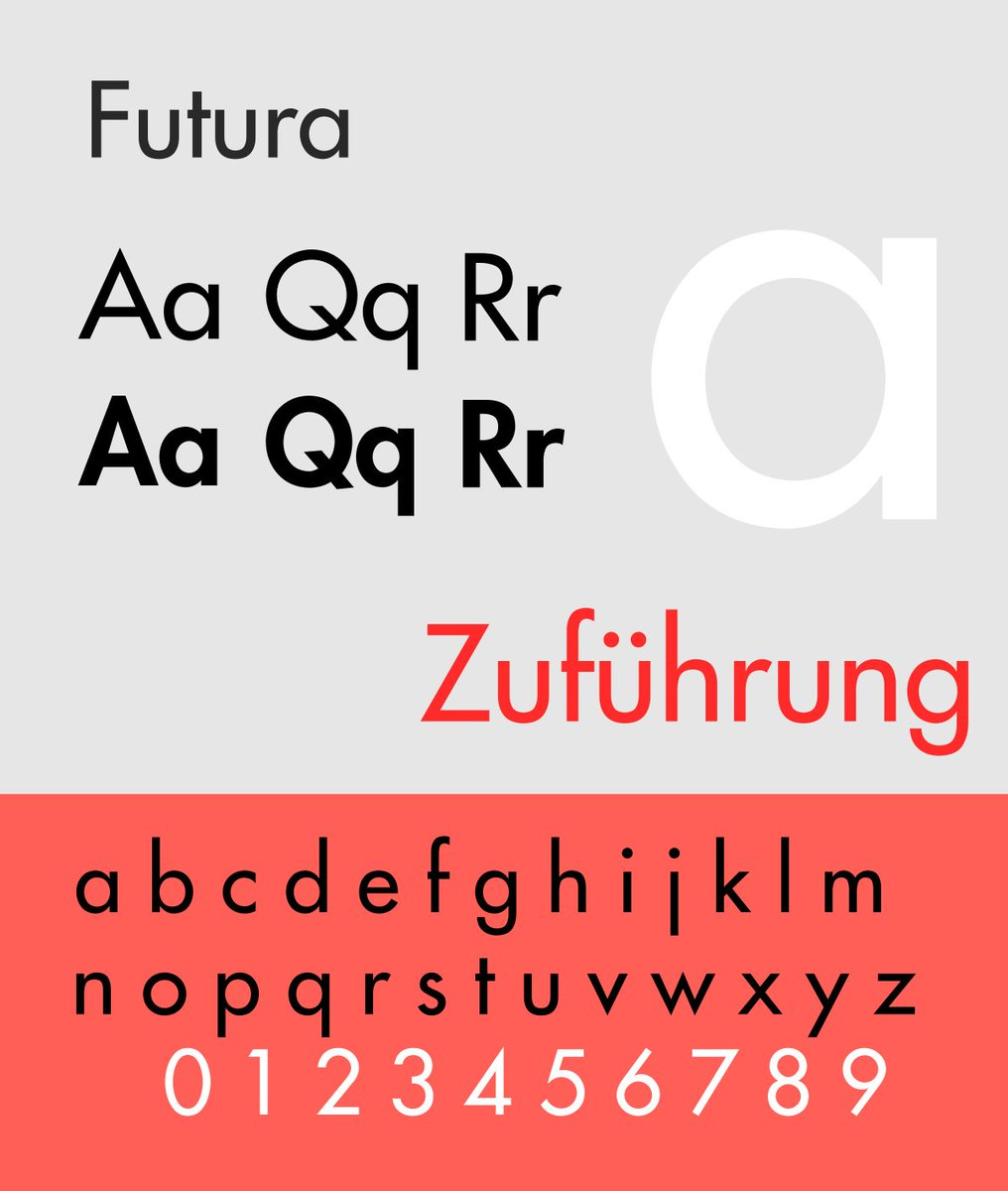
Futura
A 20th century typeface heavyweight: futuristic, imposing, & stylish. Designed by Paul Renner in 1927 under the influence of ideas emanating from the Bauhaus, and a hugely influential typeface in its own right. Futura Bold was Stanely Kubrick’s favourite font. Black Sabbath’s Sabotage uses Futura Extra Black Condensed with a hand drawn, stylised ‘S’, while Futura Demi Bold is used for both album title and band ‘logo’ on Technical Ecstasy.
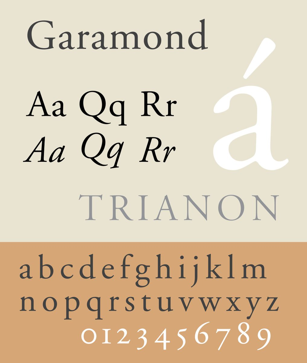
Garamond
One of the oldest fonts still in regular use. It was designed in the 1920s as a revived version of a typeface used by the 16th century French publisher Claude Garamond, though the original designer (or punchcutter) was called Robert Granjon. Renaissance revival.
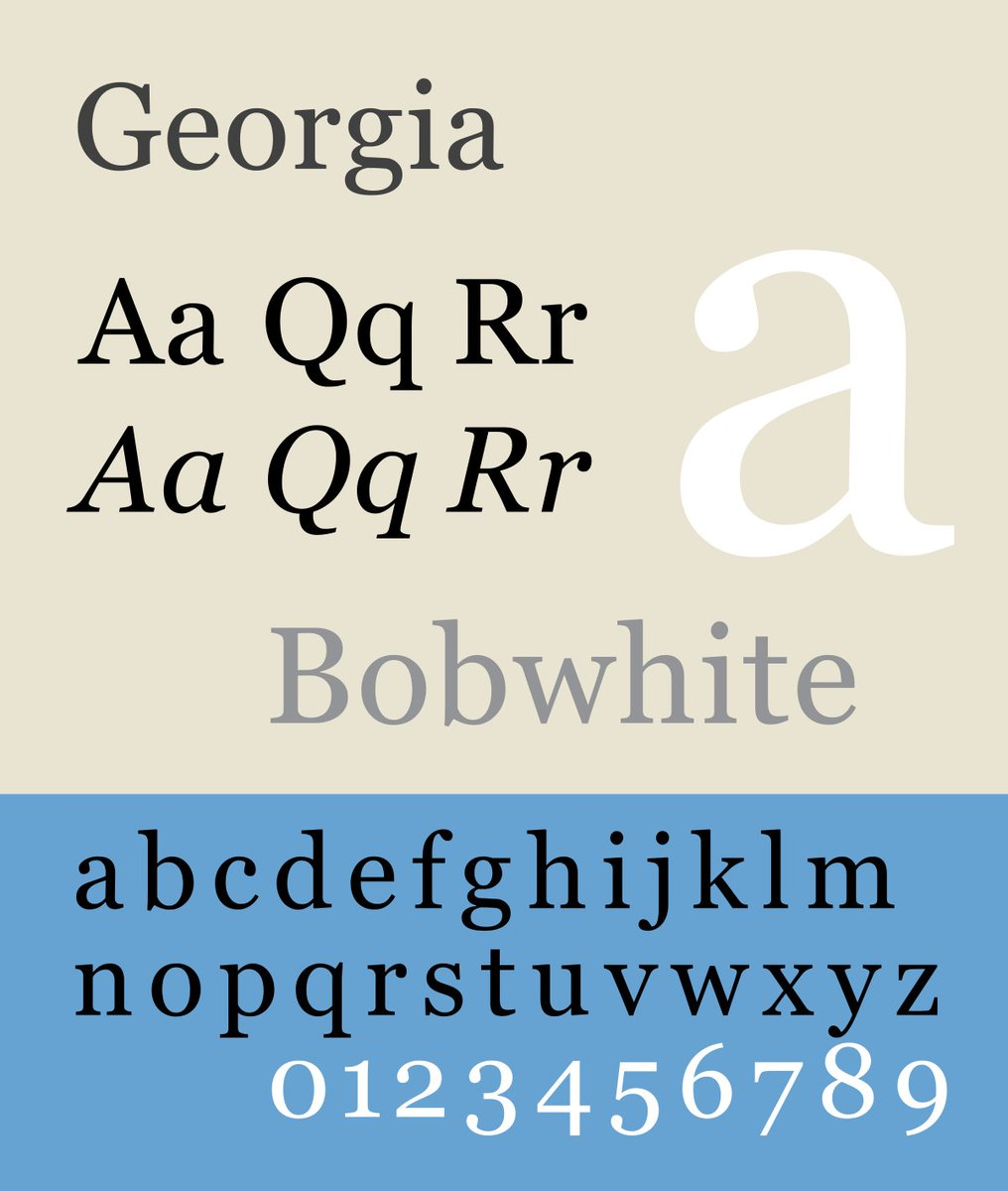
Georgia
Created by Matthew Carter in 1993 for Microsoft, Georgia is a serif font (i.e. with small strokes at the ends of letters) specifically intended for reading on a digital screen. Many old fonts, of course, were not designed this way. A serif typeface for the Digital Age.
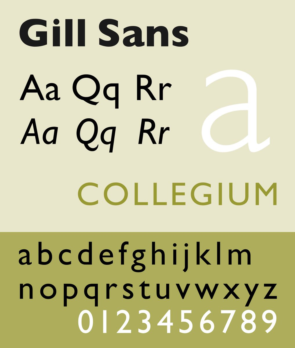
Gill Sans
The ultimate British font. Designed by Eric Gill in 1926 and based on the «underground alphabet» created by Edward Johnston for signs on the London Underground.
Penguin Books and LNER both famously use Gill Sans.
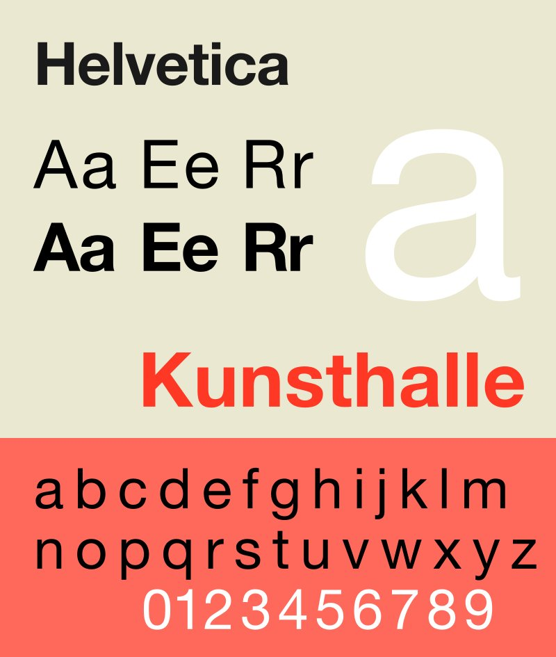
Helvetica
The authoritative modern typeface: sleek, stylish, clean, ubiquitous, and astonishingly influential; Arial is one of many imitators.
Designed in Switzerland in 1957 by Max Miedinger and Eduard Hoffmann, Helvetica quickly conquered the world. Timeless.
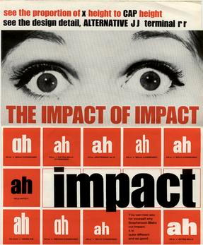
Impact
Designed by Geoffrey Lee in 1968 for publicity and advertising in Britain as an alternative to similar European typefaces.
Impact was included in Windows 98 and experienced a rather unexpected revival in the 21st century as the definitive font of choice for memes.
ITC Novarese
The font, designed by Aldo Novarese, picks up on Roman upper-case fonts carved into stone in the second century B.C. The designer of the Black Sabbath cover may have set the monumental, delicate and somewhat noble aura of the font as a parallel to the depicted angels.
Jokerman
Yet another member of that exclusive 1990s group which have somehow dominated the world ever since their creation, Jokerman was designed in 1995 by Andrew Smith (also the designer of Chiller) and named after a Bob Dylan song.
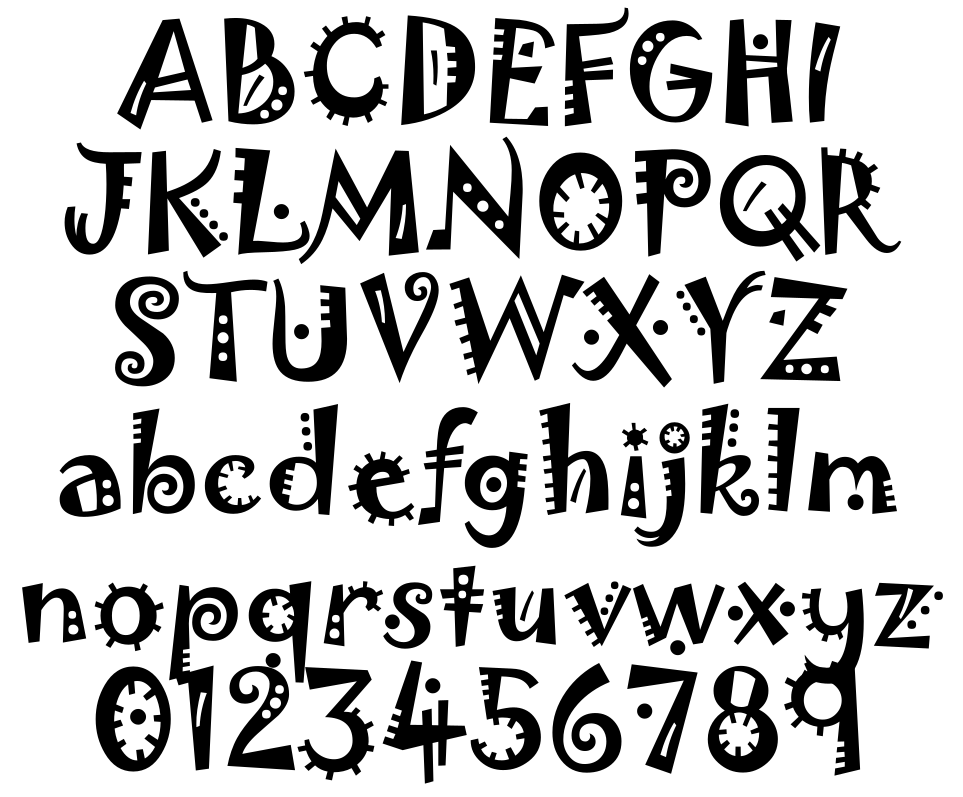
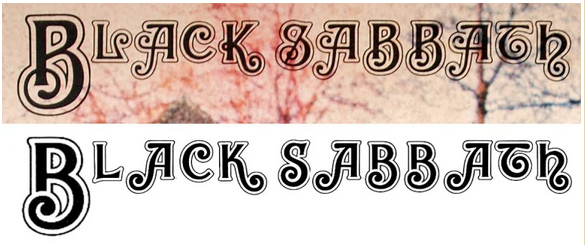
K22 Gadget
Here’s another oft-mistakenly identified Sabbath font. It’s not Baltar, Balta or Washington Black…it’s hand-drawn. The free K22 Gadget and the commercial VolumeFour by Ryan Corey is pretty close.
Kabel Ultra
The basis for the cover design on Master of Reality, designed by Bloomsbury Group and art directed by Mike Stanford. The album design is based on distorted and emboldened version.
Manuscipt Caps
Issued by Letraset as dry-transfer type in 1972, with alternates for ‘AKR’ and a ‘QU’ ligature. No good digital version available yet. The 5th revised edition (1976) of Lettera 2 (but not the original 1961 edition) shows a nearly identical alphabet as “Fancy Letter (1957)” and credits the design to Walter Haettenschweiler. Differences in ‘C’ and ‘E’ (ball terminals on both ends) as well as ‘Y’ (no top serif). The font has certain similarities with the font on Black Sabbath’s debut album, but far too many differences for it to be a close match. It would seem therefore that Marcus Keef (aka Keith MacMillan) either used the Letraset letter forms for inspiration and redrew it to suit the wording ‘Black Sabbath’ or it’s from an entirely different source altogether. The font BlackSabbath70 is a bit closer but not an «open» font. Another contender, not available for download, is called Daisy Rimmed Fancy.
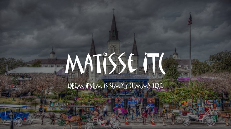
Matisse
Matisse ITC is a typeface designed by Timothy Donaldson and published by the International Typeface Corporation (ITC). It draws inspiration from the style of Henri Matisse, a renowned 20th-century French painter and sculptor. The typeface aims to convey a sense of elegance and sophistication while evoking the freedom and movement associated with Matisse’s art. Matisse ITC features characters with smooth and organic shapes, fluid strokes, and distinctive details. It is a cursive typeface that can be used in various contexts such as logo design, magazine headlines, or artistic projects. Its distinctive style can add an artistic and expressive touch to designs.
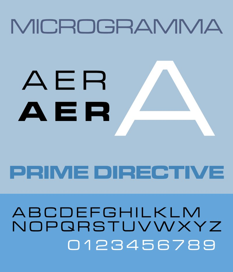
Microgramma
Designed by Aldo Novarese and Alessandro Butti (who also made the equally iconic Eurostile typeface) in 1952, Microgramma was all over graphic design in the second half of the 20th century.
Also popular in science fiction, particularly the Alien films and Star Trek.
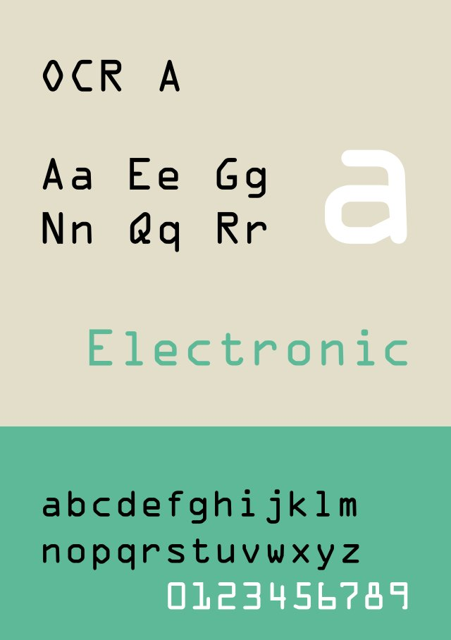
OCR-A
One of the first Computer Age typefaces, designed in 1966 to be read both by humans and machines.
Although the need for OCR-A has passed, it lingers on in many forms of documentation, and has even entered graphic design because of how distinctive it is.
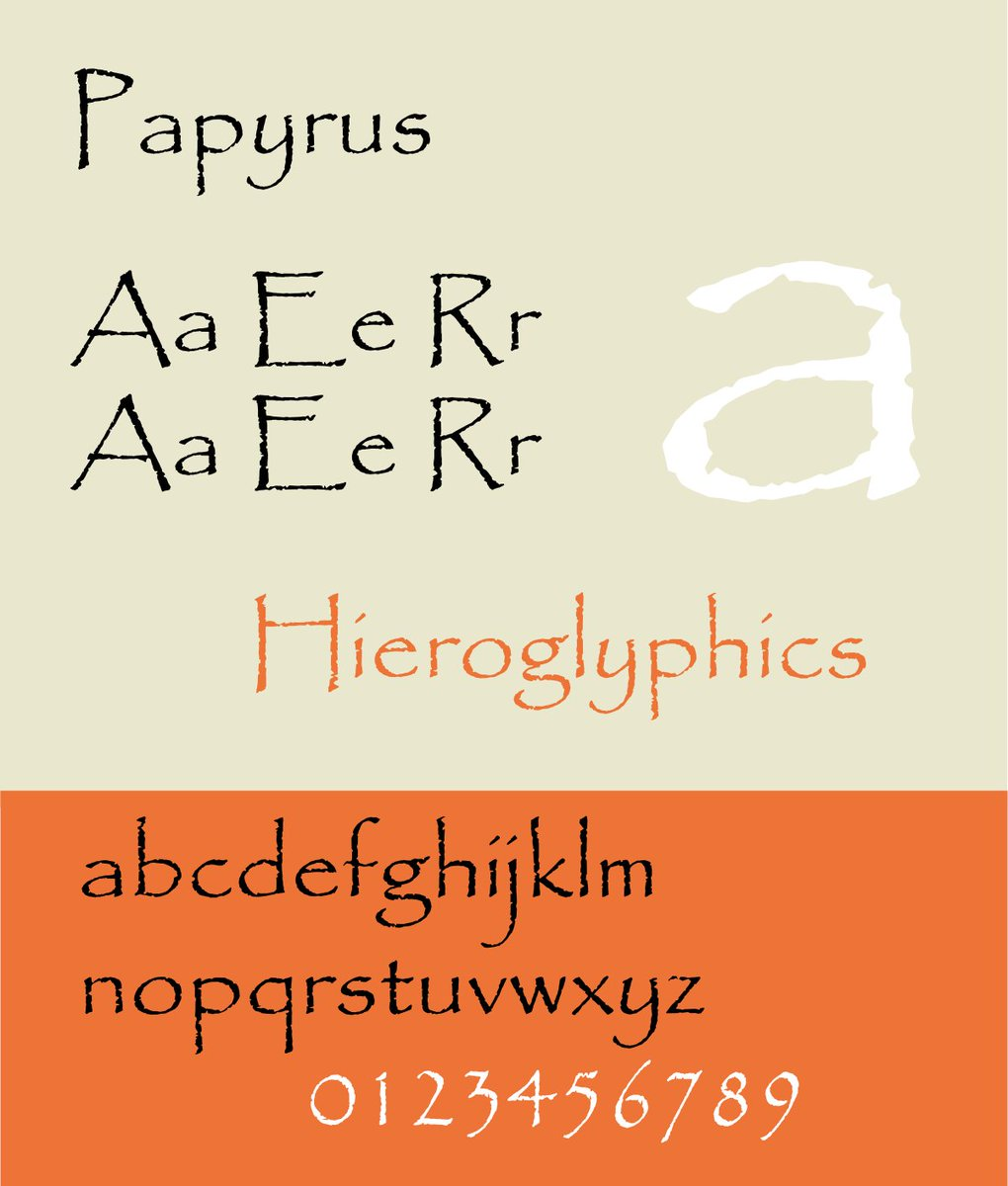
Papyrus
Designed in 1982 by Chris Costello; he tried to imagine what handwriting must have been like in biblical times. Included with Windows since 2000.
One of the most overused typefaces, perhaps most famously in Avatar (though the recent sequel has a new font).
Portago
Portago Font Family was designed by Luis Siquot. The stencil logo resembles the font used on the Never Say Die album.
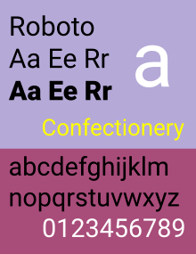
Roboto
A neo-grotesque sans-serif typeface family designed entirely in-house by Christian Robertson and developed by Google as the system font, and released in 2011 for Android 4.0 «Ice Cream Sandwich». Roboto is the default font on Google Play, YouTube, Google Maps and Google Images.
Roboto Bold is the default font in Unreal Engine 4, and in Kodi. Roboto Condensed is used to display Information on European versions of Nintendo Switch packaging,
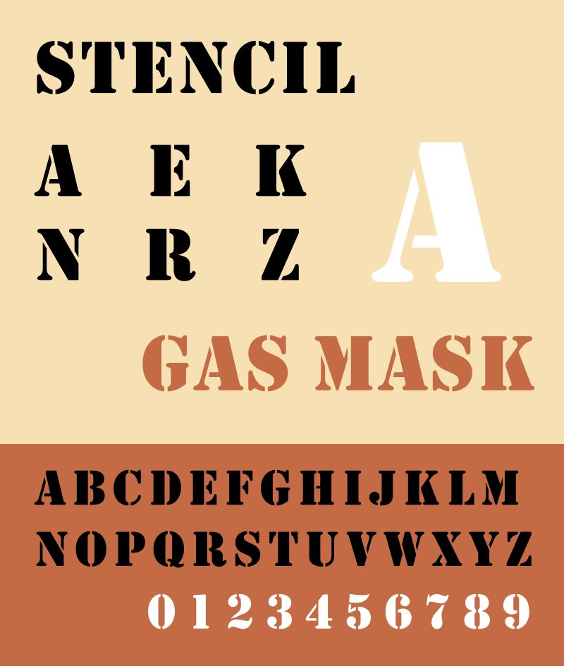
Stencil
Two typefaces, both known as Stencil, were designed within a month of one another in 1937 by R. Hunter Middleton and Gerry Powell. Usually associated with the American military; also briefly used by Real Madrid. Another ubiquitous and overused font.
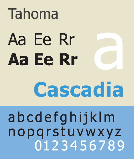
Tahoma
One of Microsoft’s sans serif typeface families, designed by world renowned type designer Matthew Carter, and hand-instructed by leading hinting expert, Monotype’s Tom Rickner, Tahoma sets new standards in system font design. It is ideal for use in User Interface Scenarios and other situations requiring the presentation of information on the screen.
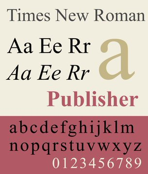
Times New Roman
Times New Roman was commissioned in 1931 by The Times of London in aim to create a more clear and efficient typography for print. Since its debut on October 3, 1932, it has become one of the most widely used fonts worldwide.
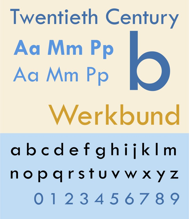
Twentieth Century
Designed by Sol Hess for Lanston Monotype in 1937; this was America’s answer to the immensely popular Futura (i.e. a knock-off version, as many fonts indeed are).
It spawned a whole family of Century fonts which are now much more common than Futura itself.
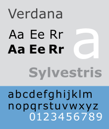
Verdana
Verdana is a humanist sans-serif typeface designed by Matthew Carter for Microsoft Corporation, with hand-hinting done by Thomas Rickner, then at Monotype. Demand for such a typeface was recognized by Virginia Howlett of Microsoft’s typography group. The name «Verdana» is derived from «verdant» (green) and «Ana» (the name of Howlett’s eldest daughter).
Bearing similarities to humanist sans-serif typefaces such as Frutiger, Verdana was designed to be readable at small sizes on the low-resolution computer screens of the period.
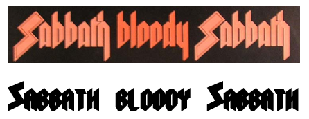
Visionaries
The closest thing to the title font on Sabbath Bloody Sabbath. Not even close though.